The challenge
To create a white label platform that could be easily rebranded and repurposed for different UK councils whilst allowing for a unique look and feel. To allow residents and council authorities to check schedules, news and events, apply for social care and assistance and report vandalism and crime in the area.
Design
In order to create a modular layout where councils could customise the content, it was essential to create a grid for content to adapt to. It was equally important that we defined clear rules on the use of colour, typography and iconography so the experience would remain consistent when rebranding.
Photographic Study
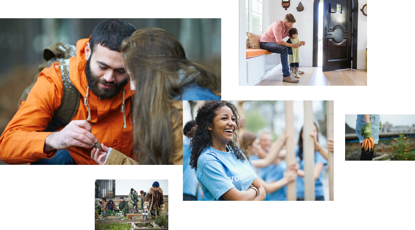
As with any council website the content can often be quite heavy. We wanted the photography to add some warmth and personality, which we could use to break up the information. I was keen to avoid using stock photography and find some natural images that would resonsate with users.
Colour
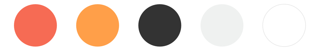
Choosing a colour palette was a difficult task as the function of each colour had to be robust enough that we could take a councils brand and easily apply it to a primary, secondary and accent colour, whilst also passing web accessibility standards.
Iconography
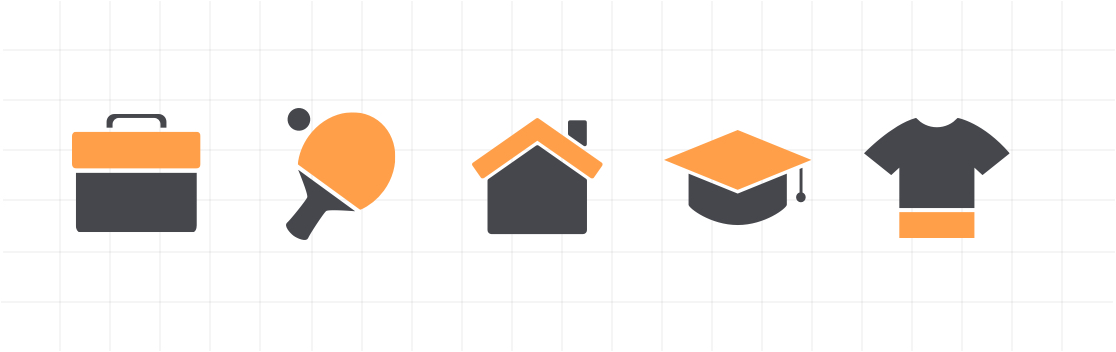
We wanted to create a reusable set of icons that we could alter using colour to look unique. All icons would have a dark base alongside a custom colour on top that could be altered using css.
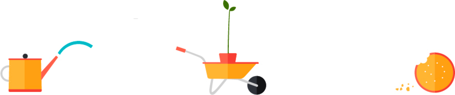
Illustration
We spent a great deal of time coming up with an illustration style, looking at various artists and illustrators. We wanted them to be playful in nature but quite simple to construct.
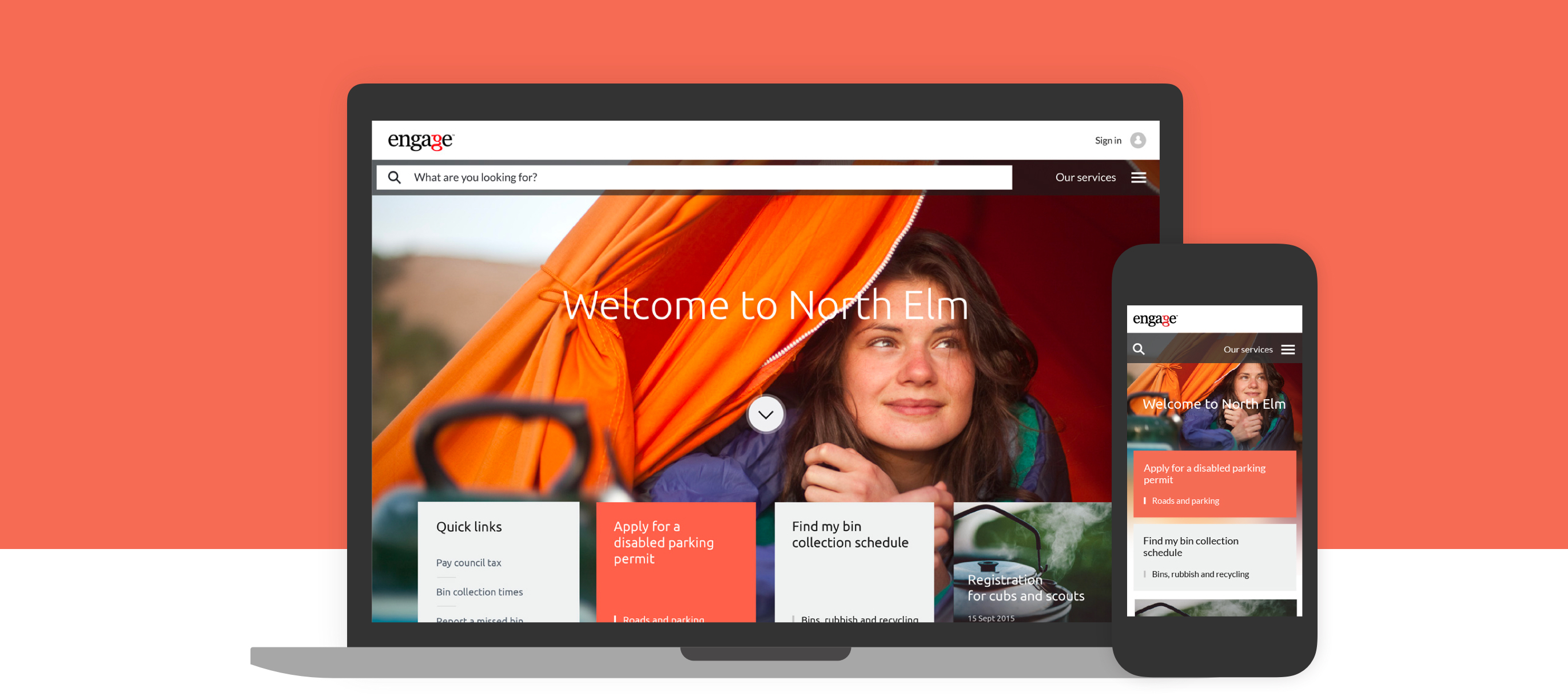
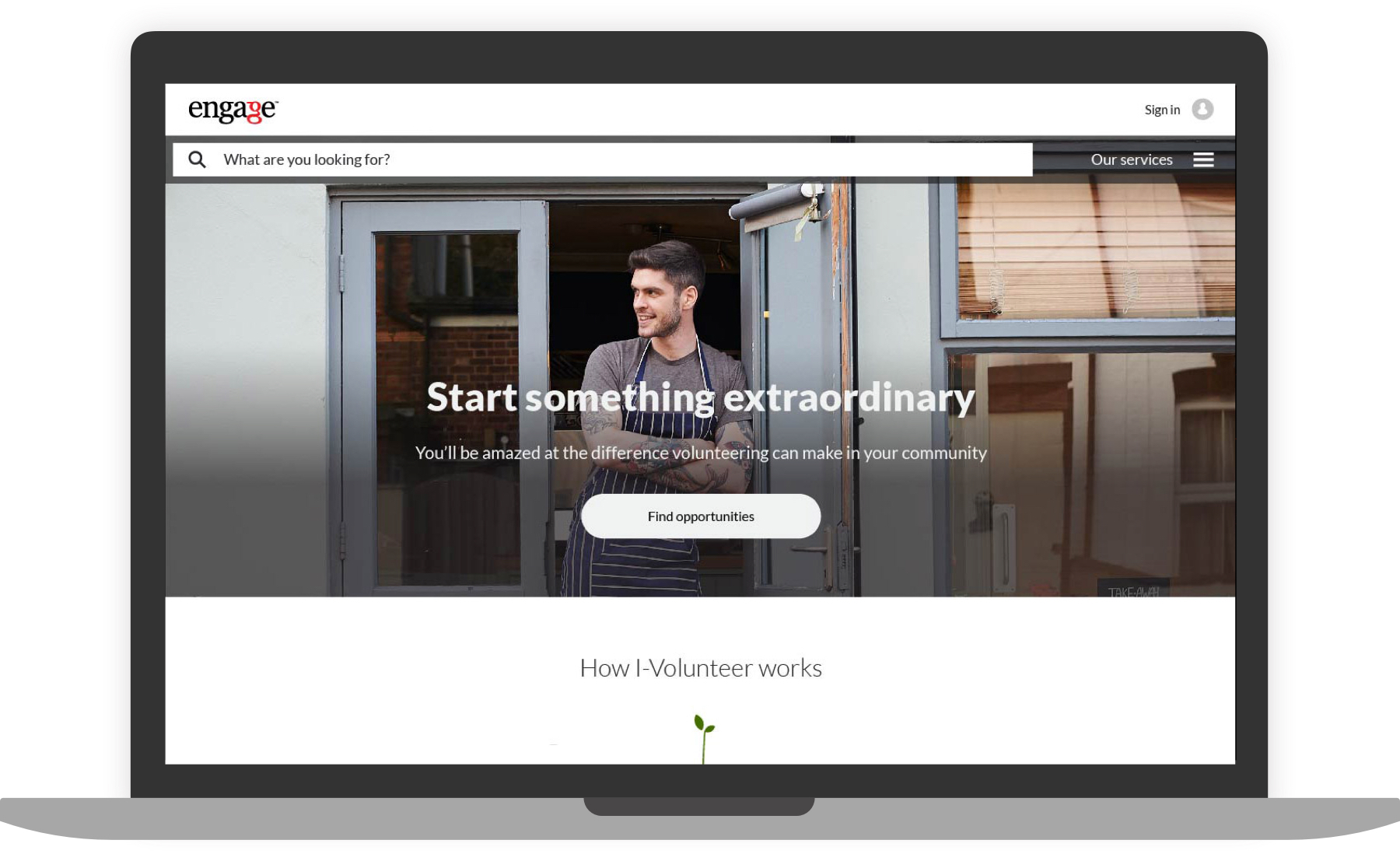
Mockups
By the time I joined the project some of the early mockups had already been created, specifically for the home page. My role was to see how different the home could look with a totally different brand and also design from scratch the key internal pages.
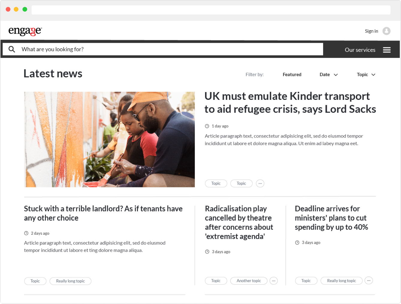
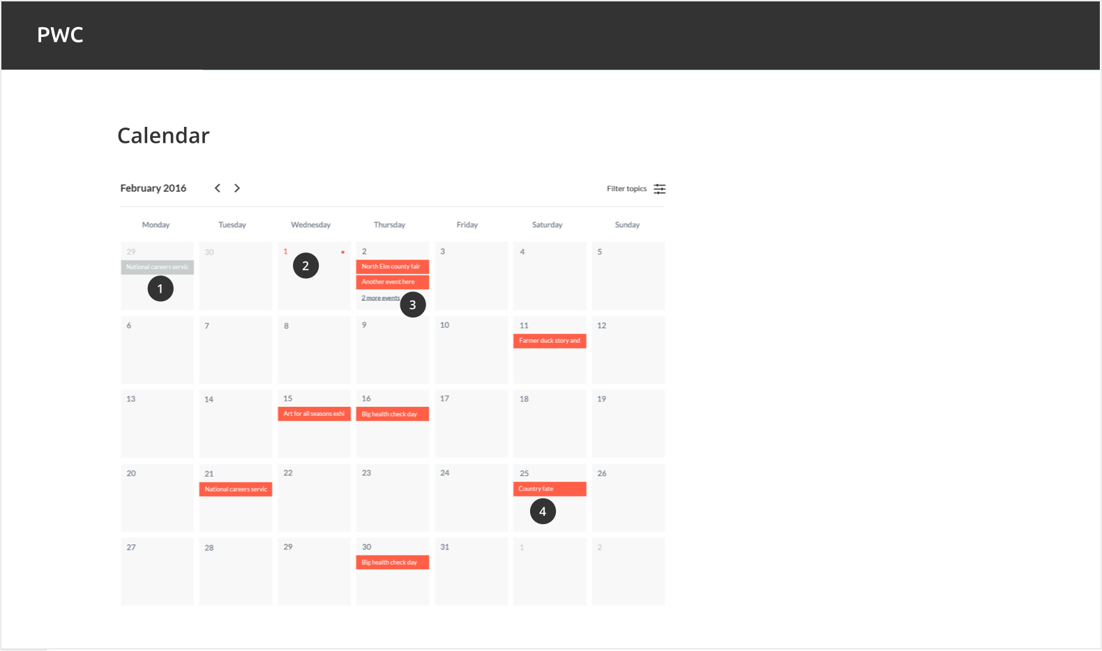
News
We wanted the news section to have the same features and filters you would expect from a major news site so that the councils what have complete flexibility when building their articles. This included the ability to add featured stories, events, calendar listings, tags, social sharing, video and more. We opted for a very clean and spacious look and feel.
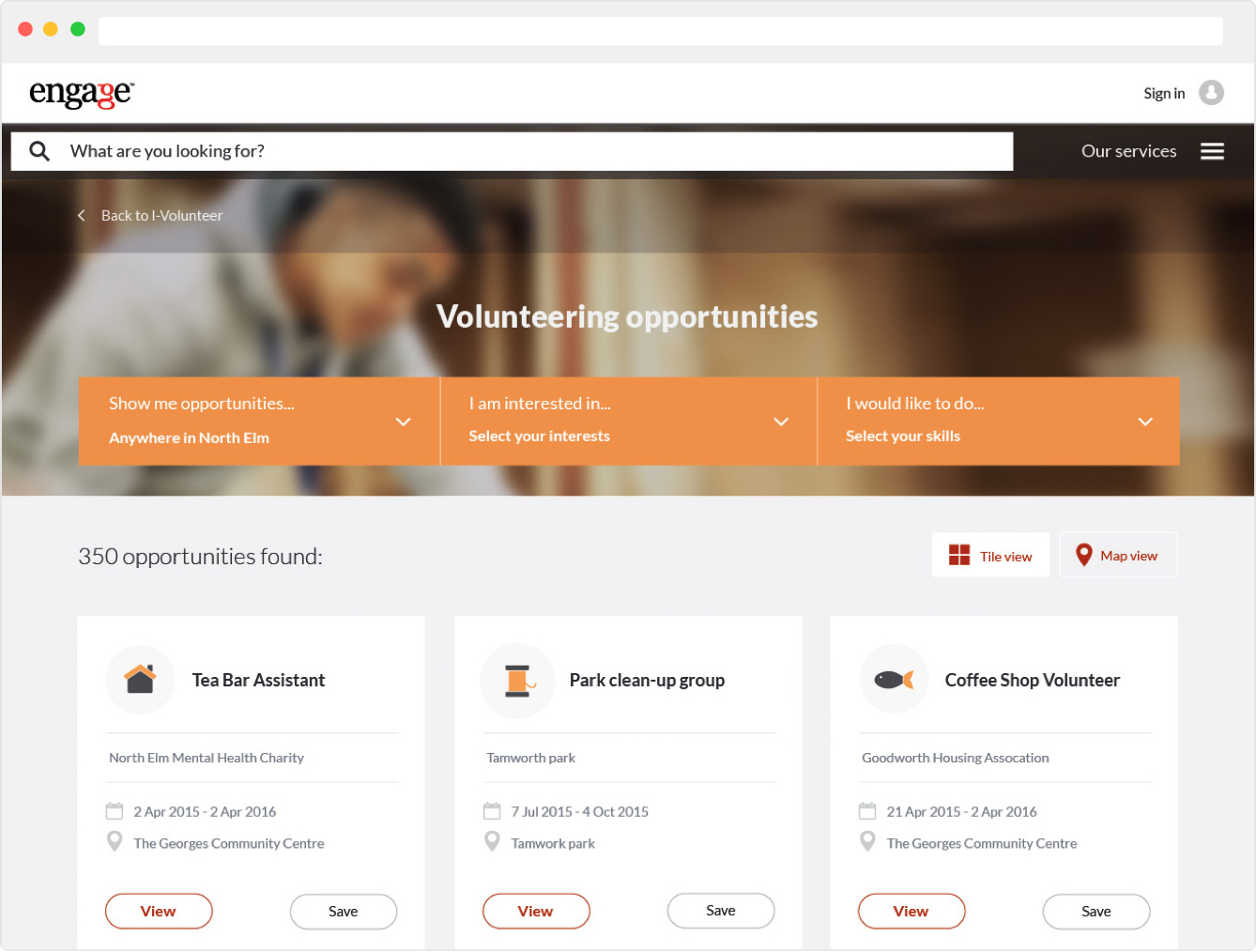
Volunteering
Encouraging people to volunteer is a difficult challenge in itself so it was paramount that the UI was simple to use but also enticing. A big part of the design here was to find the right images and icons to use but also testing the UI as often as we could.
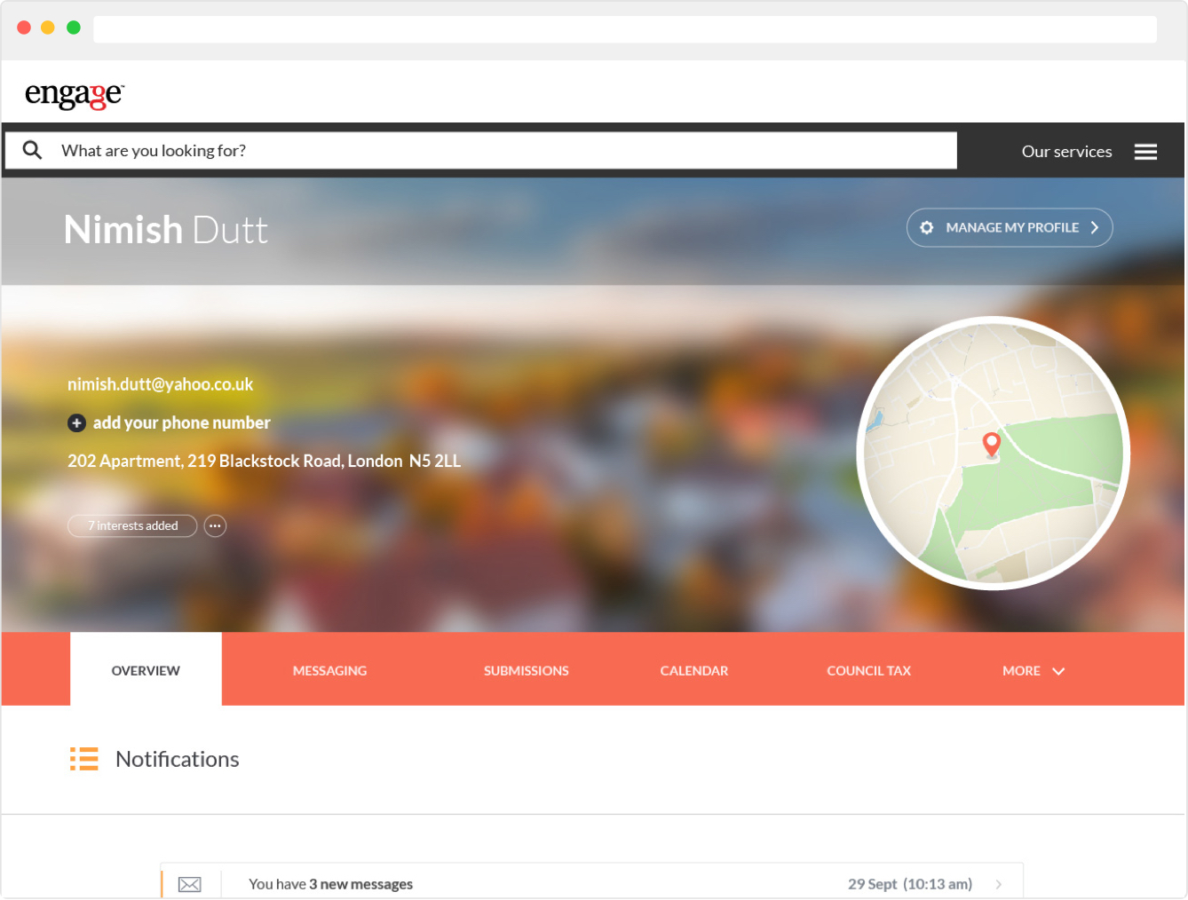
My account
There is no requirement for an account area to look attractive, function is definitely favoured often form but we wanted the account area to feel considered and personal to each user.
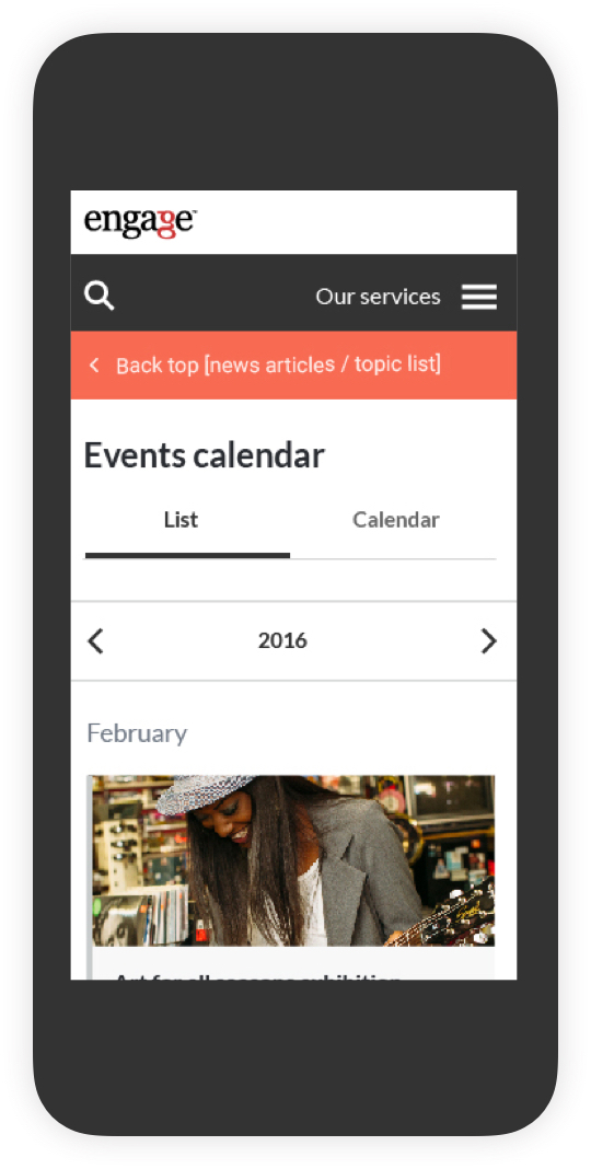
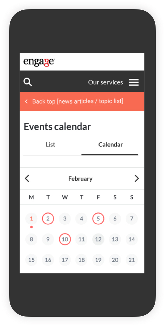
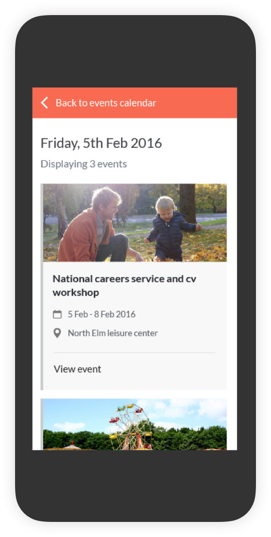
Mobile
We'd planned to adopt a mobile first approach but it wasn't always practical given the level of content on each page. Instead we focussed our attention on creating responsive components that could adapt to all screen sizes.
Documentation
With such an extensive project it was essential to document the design as extensively as we could. We used confluence as the main tool for outlining components, functionality and describing how and where the platform could be customised.
Get in Contact
Let's work together
If you like what I do and think I could be a good fit for a project or simply want to get in touch please drop me a line here.
Say hello